
Busy Bus App
User Research, Comparative Research, and UI Design for a mobile transit schedule viewing app
Summary
A transportation agency wants bus riders in the Washington State area to easily be able to view bus schedules, and determine how much time they will need to travel to the correct bus stop before their bus arrives.
Busy Bus App (fictional) aims to comprehensively display a list for each bus line that shows future and current arrival times, and update these times to reflect changes in traffic. A notification system will inform bus riders of these changes, and any other disruptions in traffic or scheduling.
My Roles & Responsibilities
As the sole UX Designer working on Busy Bus App, I independently applied the Design Thinking process through each phase of development:
User Research, Ideation, Wireframing, Prototyping, and Usability Testing.
Project Scope
Design a Minimum Viable Product for Busy Bus App, keeping Accessibility in mind. Conduct a Usability Test to make necessary UI improvements.
Time Constraint: 4 weeks


Problem
Seven new bus lines were introduced in the Washington State area. Bus riders want to know which buses are arriving at their stop, and when.
Audience
Bus riders in the Washington State metropolitan area
All ages, occupations, income levels
Consider that some users may be disabled, or have limited literacy and language abilities
Solutions
View buses arriving & arrival times
Find nearby bus stops
Travel time to destination
Notification of bus arrival
Discovery & Research
70% of bus riders surveyed need help finding the nearest bus stop.
Over 57% of bus riders surveyed miss the bus occasionally or more.
Bus riders were asked to select features they use most on Google Maps. This helped determine some key features to include in the user flows.
Comparative Landscape
Key takeaways from SWOT Analysis conducted on D.C. Metro App to inform the ideation process
Uses location to display nearest stop
Notifications of changes & disruptions
Two map display options
Add favorite or frequent destinations
Instructions with first time use
Search for travel routes
Personas developed to represent real people in Busy Bus App’s Target Market -
Persona 1: Frequent Bus Rider
Persona 2: Occasional Bus Rider
Information Architecture
Branding
Original Style Tile
First Iteration Usability Testing
100% of participants completed these tasks in under 2 minutes:
Identify when a specific bus would be arriving at a stop
Bookmark that bus stop
Determine which bus stop has the soonest bus arrival
(2 minutes was determined to be the maximum amount of time a user would be willing to spend looking up info)
Positive Findings
Majority of participants used map home screen to complete tasks.
Few participants used the search bar.
Both groups agreed having both ways to find solutions is necessary for usability and convenience.
Points of Friction
Indicator circles were initially mistaken to represent bus line colors.
Prefer lists in darker color palette for better visibility.
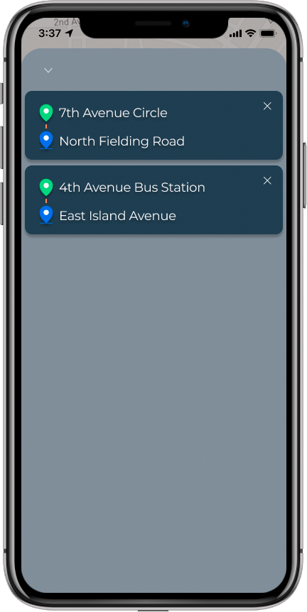
Want to save specific bus routes, not whole bus stops with multiple routes.
UI Adjustments
Text added to bus stop indicators on home page map to improve accessibility for colorblind users
Delayed bus indicator changed from orange to red for a more universally understood color of caution
Minor adjustments made across other screens to meet a new WCAG score of AA


Prototype
Previews best on a desktop computer.
This demo is a limited clickable prototype.
Hit “R” on your keyboard to restart.
Final thoughts
Conducting user research is an essential step in setting the foundation for designing with accessibility in mind. This was the first assignment I independently completed in Thinkful’s UX/UI Design Bootcamp, so respondents to my user survey would not provide a true representation of all bus riders.
In a real life situation, a team of UX Researchers should spend a greater deal of time dedicated to more extensive surveying, and interview a larger pool of bus riders to gather a better and more refined set of data to refer to during app development.
Improvements could be made in the Bus Route screens to better distinguish the bus arrival times from the Bus Stop screen’s “bus arriving in” times. Adding a navigational system to help users to and from their bus stops could improve the experience as well.